Transparent insurance with a dash of delight

My role
UX designer in a team of three
Goals
Increase user engagement and sales
Timeline
4 months
UX designer in a team of three
Increase user engagement and sales
4 months
Osiguranik is an insurance marketplace in Serbia. Users can compare policies by different providers and buy the best one for them.
The client's goal was to reposition their brand and increase conversion and retention rates among young, educated travellers. They did that by overhauling their website and visual identity.
In a team of three at Alpha Design Studio, I moved between the details and the big picture: from visual identity to information architecture, from illustration to interaction design, and from UX writing to QA.
Product lead (Milovan Jovičić) was responsible for strategy and client communication, while a senior designer (Andrija Jonić) created initial concepts that informed my wok.
In a market where online shopping isn't widely adopted, the client decided to focus on early adopters: young people, highly educated, frequent travellers. The team aimed for a visual presence that resonates with this user group.
Aiming for a bold, playful, and clean feel

Inspiration from other playful insurance brands (yes, they exist) helped bootstrap design ideas
With guidance from the product lead, I designed a new feature: a way to compare insurance policies. The old website offered a comparison of prices—we expanded it to features and benefits for added transparency and informed decisions.
Another effort to build trust was creating an About us page that presents the client's team and explains the purchase process in more detail.
About us page
We also wanted to help people find what they need quickly. This included reorganizing navigation and including an FAQ page to provide support in times of doubt.

Navigation overhaul to help users find what they need faster
On the old website, if you wanted to see whether vehicle insurance covers e.g. motorcycles or boats, you'd need to start the purchase process and find out as you fill in the purchase form. On the new website, we wanted visitors to be able to understand the offering right away. Surfacing this information on product landing pages helps set proper expectations.
Travel insurance: transition from product page to the purchase flow
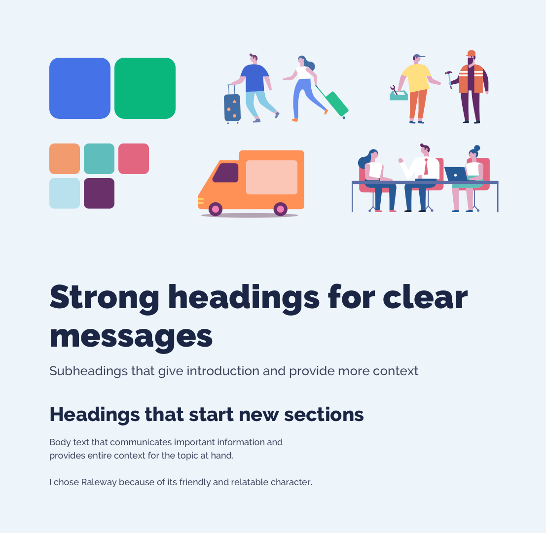
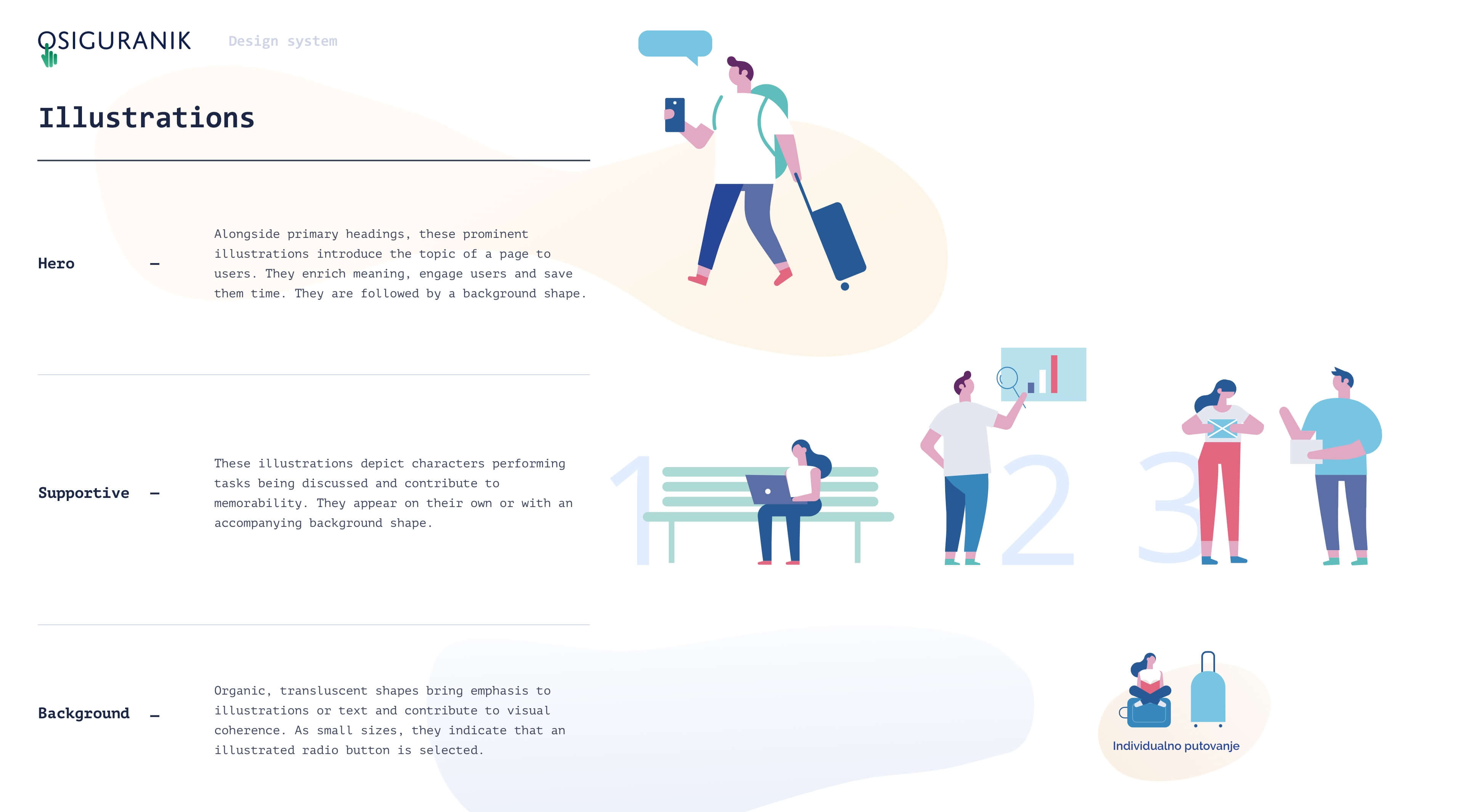
I created a pattern library to help make the user experience consistent and developers' work more efficient. Here are a few snippets.


Designing mobile-first helped the team focus on the most important content

Click through these slideshows to see a sample of screens
Redesigning Osiguranik's website helped elevate the brand and support the company's transition to a new stage of business.
The new design was launched in 2020 - see it live here.


